
Document your UI designs using a style guide
You are a UI/UX designer (fresher or experienced) assigned to your first green-field project. The requirements are well-documented, and you’ve read the user stories in and out. It’s your responsibility to define the look & feel - from colours and typography to the overall tone of the app. You’ve spent a good few hours preparing a mood board with inspiring images, colour palettes and font combinations.
Like most designers, if your next step is to start designing the home page (or the dashboard), STOP. Instead, start with a style guide.
What is a style guide?
A style guide is a blueprint for your design - a detailed breakup of various elements, components, and attributes. It serves as a documentation of your design elements and design choices.
What's in a style guide?
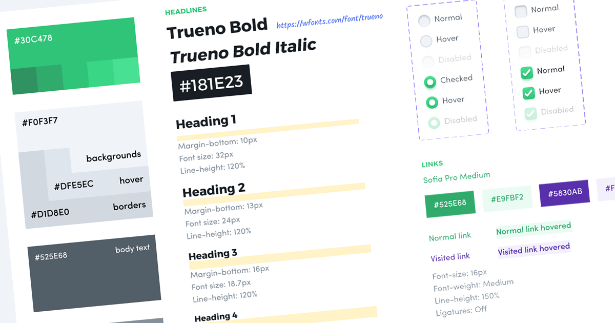
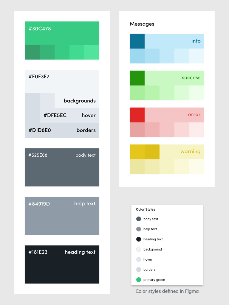
Colours
Colour codes (HEX or RGB) for,
- Tones - Primary, secondary and tertiary if required.
- Backgrounds - Light and dark themes.
- Text - Headings, body text and links.
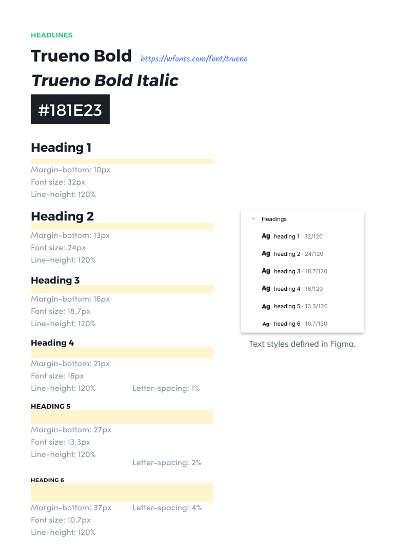
Fonts
Font family, size, line height and letter spacing for,
- Headings
- Body text
- Special-purpose elements like code blocks and quotes.
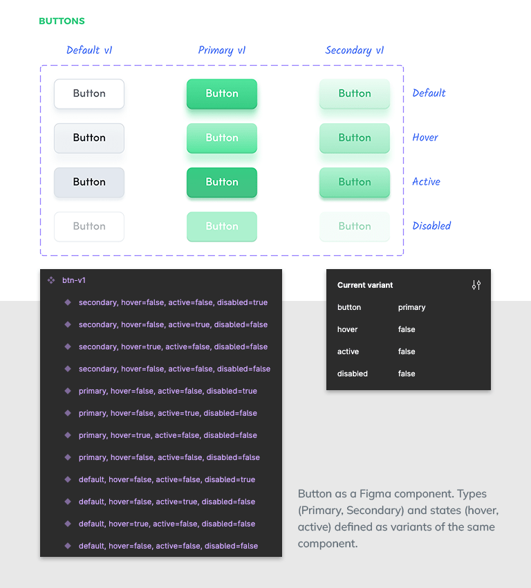
Buttons
Font, colour and box-sizing for
- Colour variants - Default, Primary and Secondary
- Content variants - Default, With Icon
- Sizes - Default, Compact and Large
- States - Default, Mouse over, Clicked and Disabled.
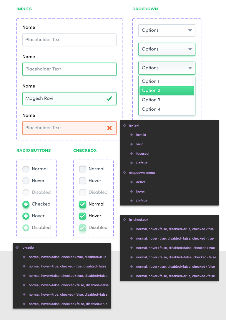
Form controls
Font, colour and box-sizing for,
- Native input elements - Text box, Radio buttons, Checkboxes and Dropdown menu.
- Interaction states - Default, Mouse over, Focused, Clicked and Disabled.
- Validation states - Validation in progress, Valid and Invalid.
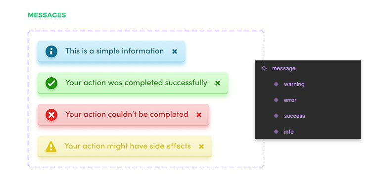
Custom components
Font, colour and box-sizing for non-native, project-specific components like,
- Alert messages
- Modal windows
- Searchable dropdown menus

Design choices
Most importantly, a style guide documents decisions that define the design language.
Examples,
- Corners - Should you use flat or rounded corners? If round, what is the default value?
- Shadows - Should you use shadow decorations to highlight depth? If so, are they single-layered or multi-layered? What is the default value?
- Gradients - Should you use solid colours or gradients? What is the permitted number of colour steps? What is the default gradient angle?
- Margins - Unidirectional (bottom-only) or bi-directional (top and bottom)?
Benefits of using a style guide
- Consistency: Elements are consistent across pages/screens. Even when you return to a project after six months, the design style guide will get you up to speed within minutes.
- Saves time: Reuse elements across screens. Change variants and states with a click. To modify a design element across screens, changing the master will let you update all child instances.
- Easy translation - A design style guide eases building the frontend style guide (using KSS). More on this in a separate blog post.
I use Figma for all my designs. If you are new to Figma (or to design style guides), I have a sample design for you. Check out the saved colours, text style definitions and components. If you liked this post, please share it with one other person whom this might help.