
TyreFinder UI Design
I'm building this TyreFinder application because of two reasons,
- Database design
- UI design
Database design
A tyre's technical specification is very complex. Many parameters like tyre size, rim size, ply rating and load capacity indices make storing them in a database, searching and querying quite challenging.
After going through large amounts of spreadsheet data, I designed a database schema that solved this problem.
UI design
The most important page for a customer - the tyre-detail page is predominantly poorly designed. This page displays all the technical data associated with a tyre for a customer to decide on a purchase. However, the technical data part is presented in tabular format, making it not responsive. There is a far better way.
For now, I'll focus on the UI pitfalls in existing sites and how to solve them in TyreFinder.
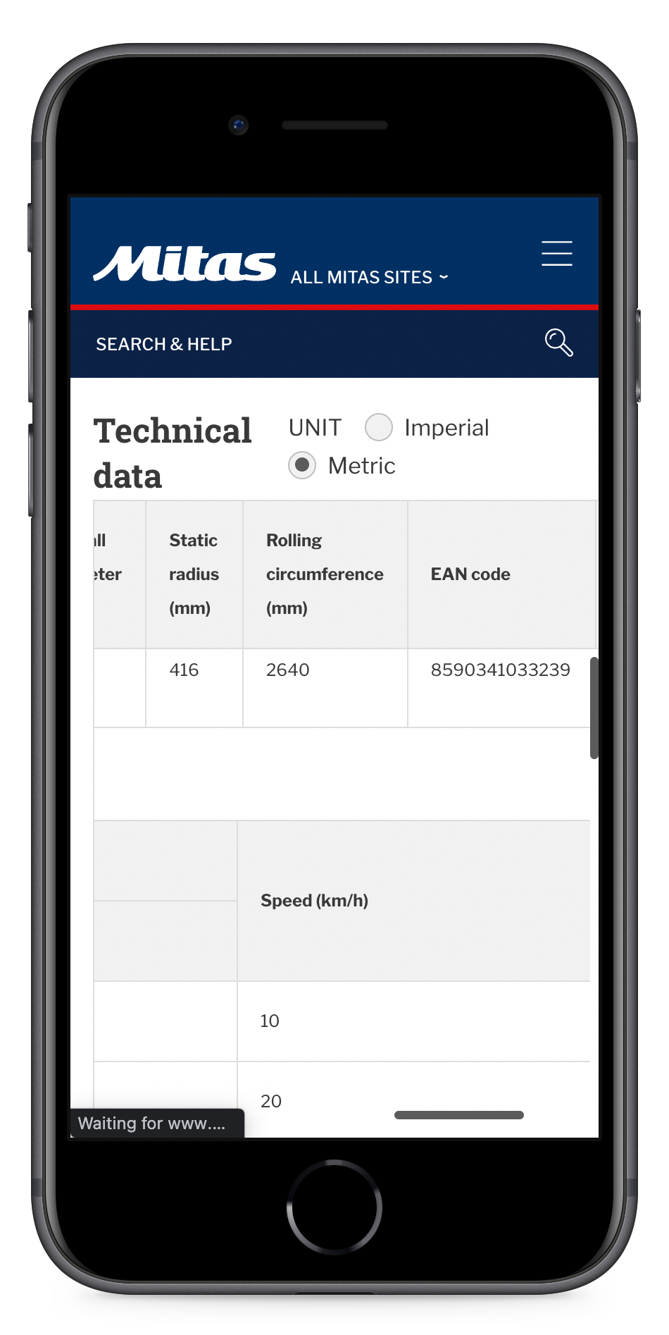
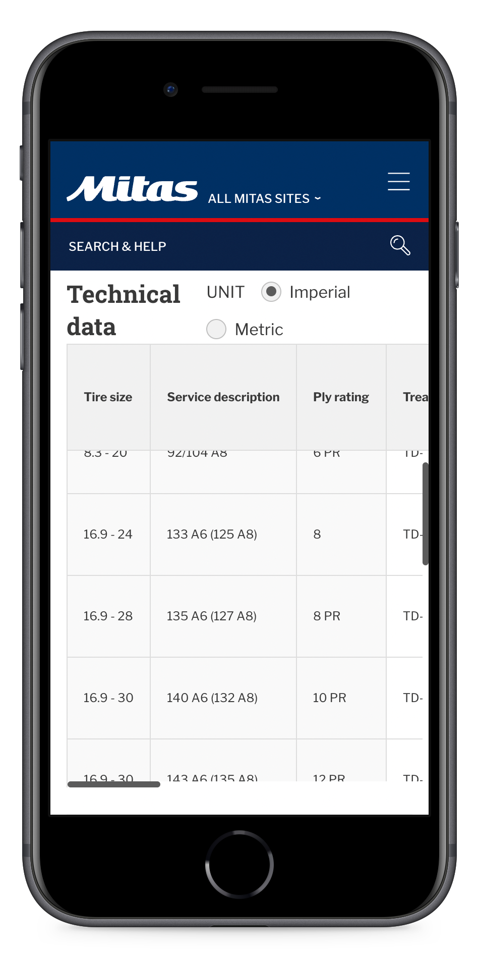
Here are a few screenshots from websites of various giants in the tyre-manufacturing industry.
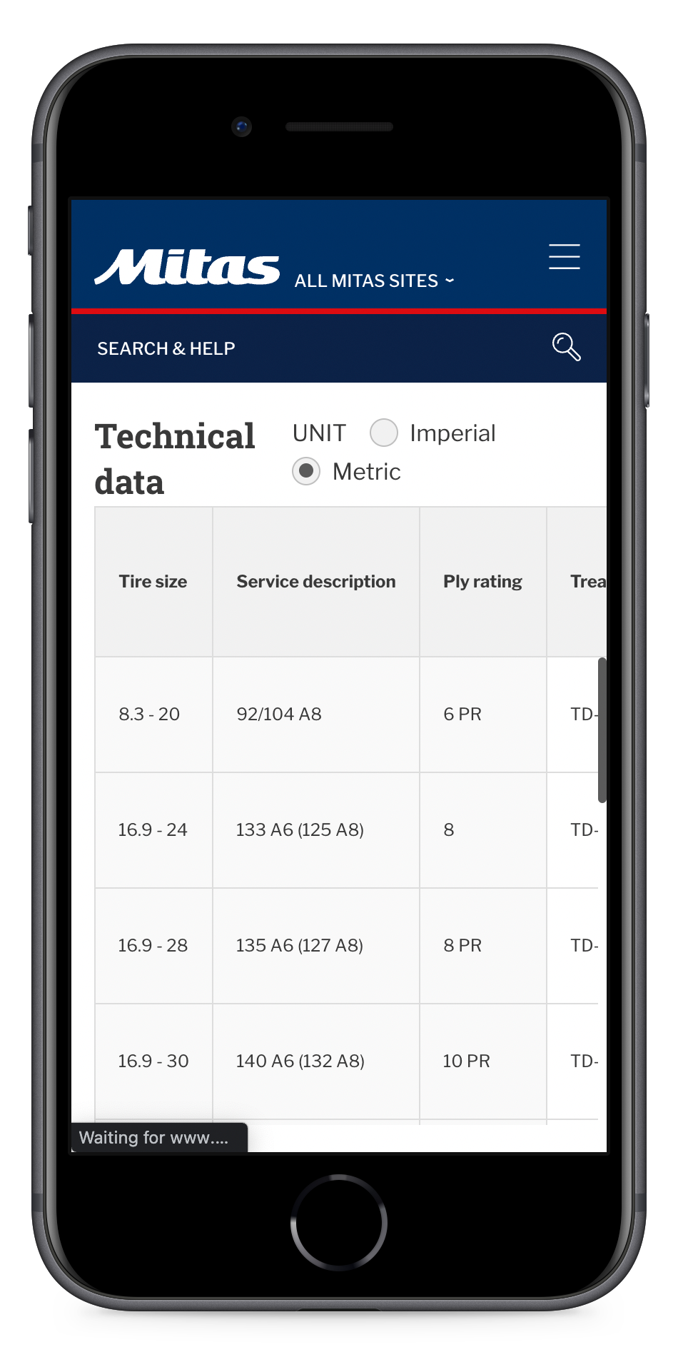
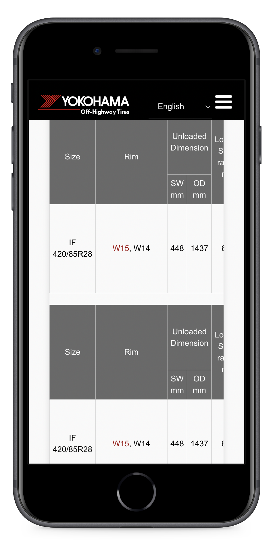
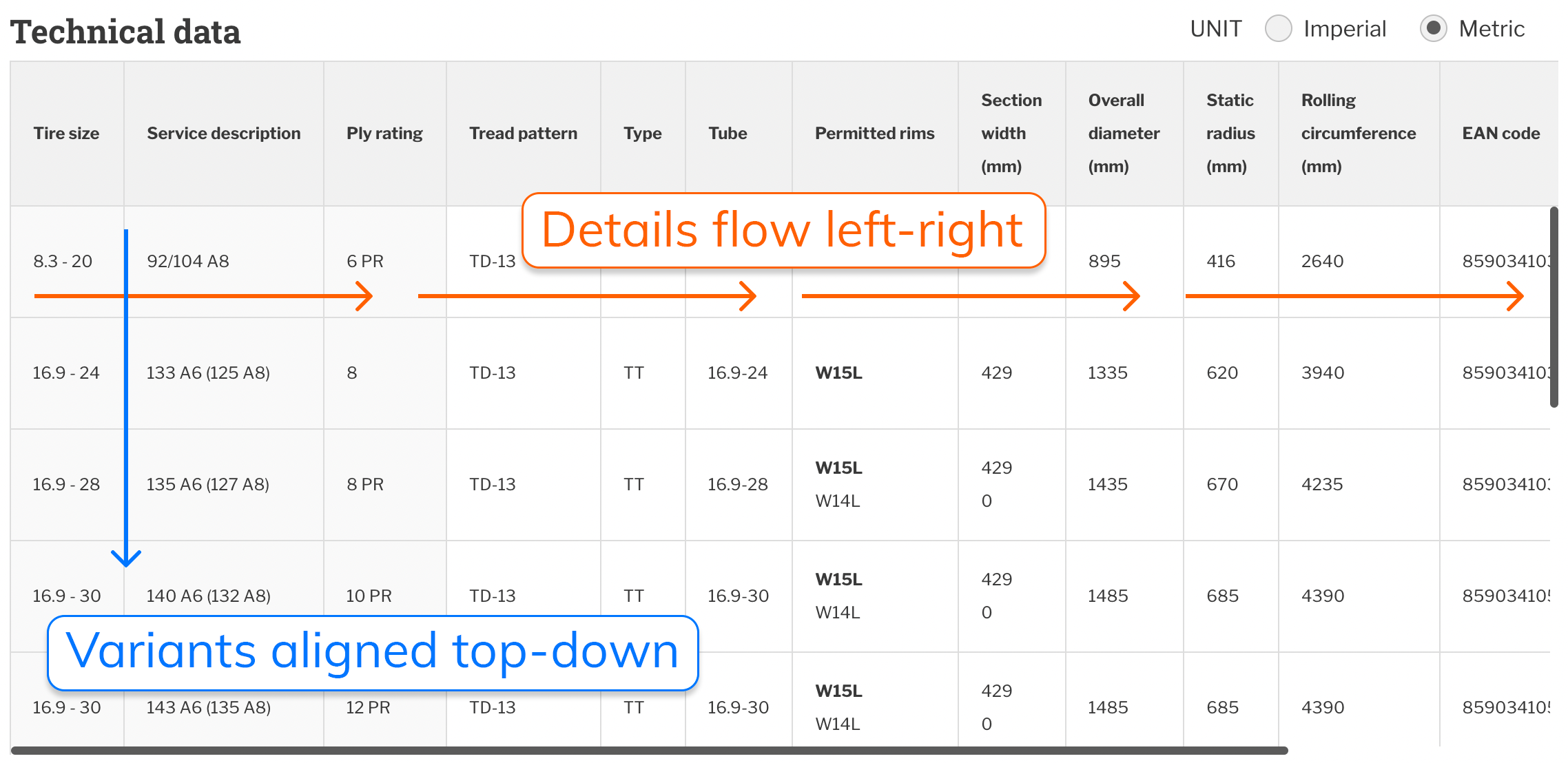
Problem 1: Responsiveness
Notice how they display technical data in a tabular format, and the hierarchy of data flows from left to right. As a result, in mobile devices where the width is smaller, the user must scroll horizontally, losing context/clarity.
Problem 2: Interactivity
Tyres have variants with different sizes and ply ratings. With more variants, the number of rows in the table increases. In such cases, a customer should have the ability to pick a variant and see only its details, i.e. drill down or zoom out with ease.
Currently, no website does this well.
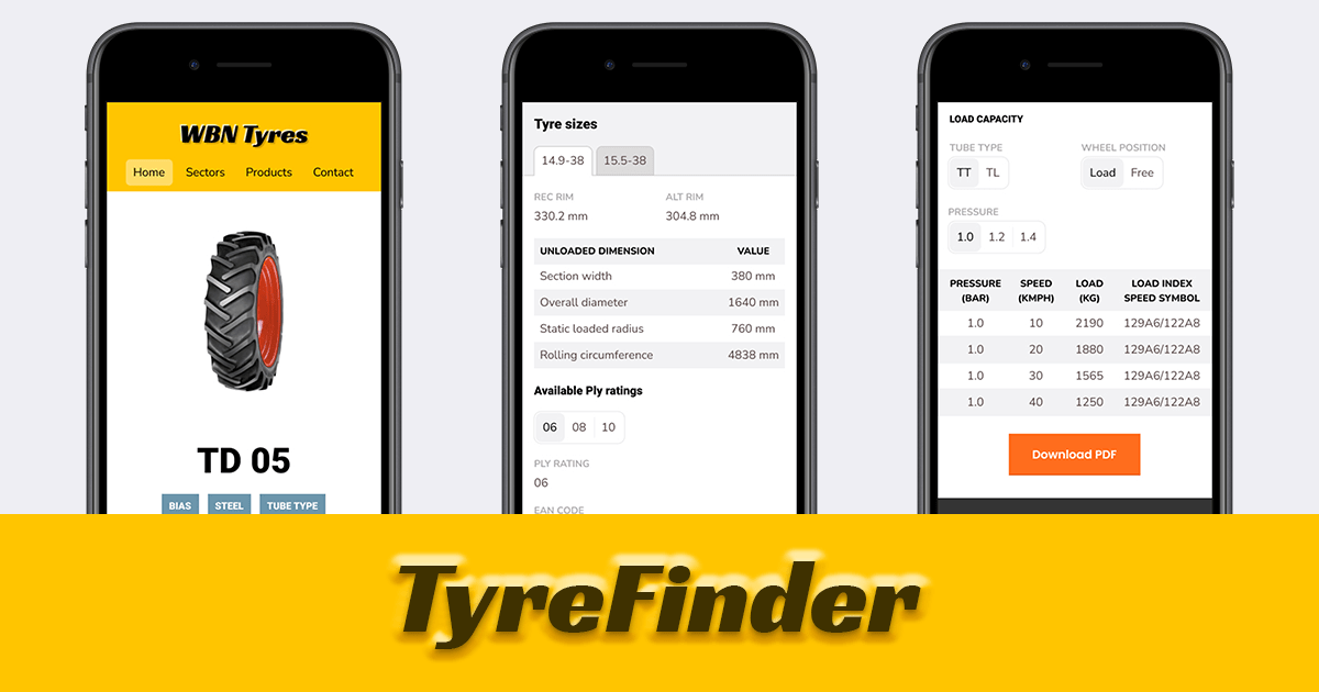
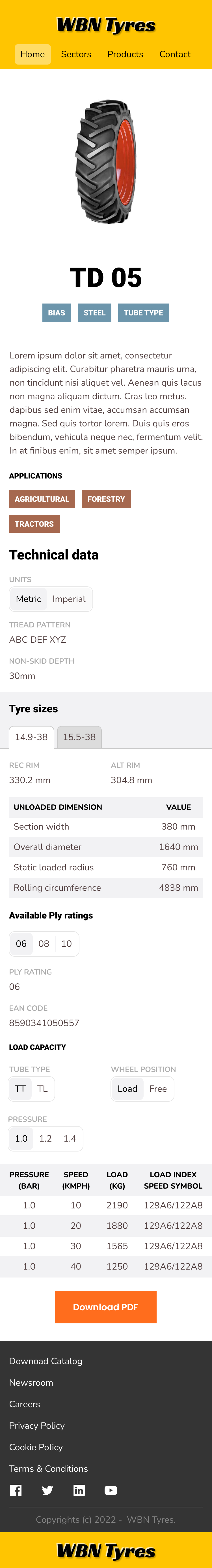
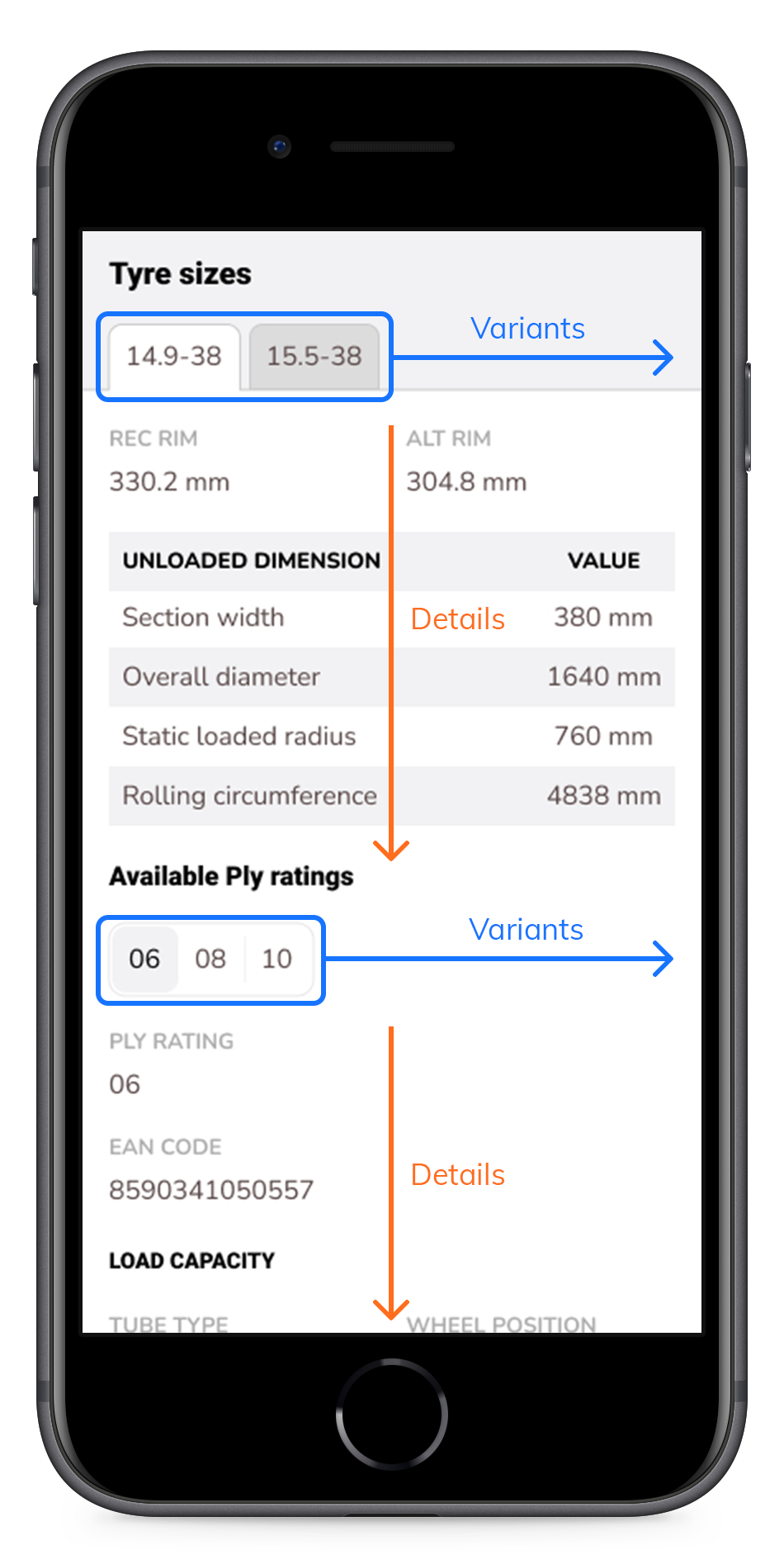
Solution: A fresh new design
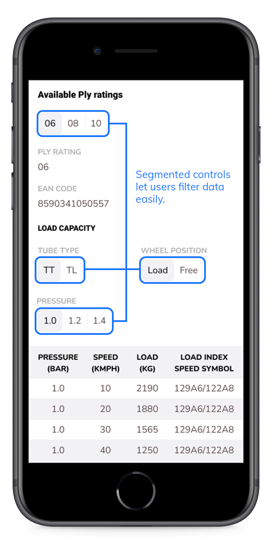
I want TyreFinder to be responsive with the best aesthetic and functional design. As in every other project, I follow the mobile-first strategy for UI design. Here is the first draft.
Scroll inside the phone viewport below to see the full design.
Looking at most reference websites, you can see data branching out from left to right, forcing users to scroll horizontally on mobile devices.
I flipped the data flow/branching top-down to align with the users' natural scrolling direction.
I also grouped related data and placed segmented controls so that users dive in/zoom out with ease without losing context.
Engineering the data storage and the user-interface solution for such a complex need pushed me to build this product. That's what I'll be doing in the next couple of weeks. Keep watching this space for updates.